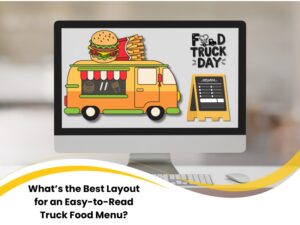
What’s the Best Layout for an Easy-to-Read Truck Food Menu?

When it comes to food truck websites, the layout of your menu can make or break the customer experience. In fast-paced, mobile-first environments, users need to skim and click with ease. If your digital menu design causes delays or confusion, people bounce, and you lose the sale. This guide will walk through the biggest website menu layout mistakes, what frustrates buyers online, and how to design your digital menu for readability and conversion. Whether you’re just launching or refining your current site, getting the menu structure right is crucial for user flow and customer trust.
Why does the layout matter in a food truck menu
Food truck websites don’t get a second chance. Most users visit while on the move, often from their phones. If your online menu layout isn’t immediately legible and tappable, users drop off fast.
A cluttered, poorly structured menu slows users down. They can’t scan or sort options easily, which leads to frustration. When customers can’t find what they want quickly, they don’t hang around. Here’s why your web menu layout matters:
- Improves scanability across mobile and desktop
- Reduces bounce rates from key landing pages
- Supports conversions by highlighting high-demand items
- Reflects the professionalism of your food truck brand
Your food truck site should place the menu at the front and centre. Consider fully customised food truck web designs that prioritise clarity, speed, and visual hierarchy.
How poor menu design confuses customers
Design flaws are magnified on websites. What might be a minor print issue becomes a major UX problem online. If your site’s menu is visually inconsistent or lacks clear navigation, it disrupts the entire experience. Some common website-specific mistakes include:
- Menus as images (non-clickable, non-responsive)
- Overuse of fonts or colours that hinder readability
- Lack of responsive formatting for mobile devices
- Missing price visibility or broken buttons

These issues erode user trust. Visitors struggle to find items, can’t see pricing, or tap broken links. That frustration often leads to abandonment. To stop losing users this way, consider layout and interaction upgrades, especially tweaks that make your food truck site more interactive to support better browsing and faster decision-making.
What frustrates buyers when menus aren’t user-friendly
Web users expect simplicity. The more effort it takes to use your online menu, the less likely they’ll order—or even stay on the page. Frustrations with digital menu design often include:
- Endless scrolling due to no anchor links or jump buttons
- Tiny text or squashed layouts on mobile screens
- Lack of visual hierarchy between categories and items
- No dietary icons or photos to support quick choices
These oversights create decision fatigue. Instead of building anticipation for your food, the site feels like a chore. Users won’t explore the full range if the experience is clunky. Addressing these flaws with thoughtful UX and structure—like design ideas that improve customer flow can keep people engaged and ready to order.
How to organise a food truck menu for maximum clarity
Your food truck menu should be one of the most accessible parts of your website. Organisation is key. It’s not just about having sections—it’s about how those sections behave on mobile and desktop views. Here are the essential layout tactics for digital menus:
- Use collapsible sections or accordions for categories
- Sticky nav or jump links for quick scrolling
- Grid format for popular items with images and buttons
- Consistent price formatting with visible CTAs
- Mobile-friendly spacing and tap targets
All elements should be coded, not embedded images, so they scale properly and remain accessible. Here’s a comparison:
Name | Position | Office |
Category Layout | One long scrollable list | Accordion-style with headers |
Price Visibility | Hidden or inconsistent | Aligned, bold, always visible |
Call-to-Action Buttons | Missing or too small | Prominent and mobile-optimised |
Responsiveness | Static design or horizontal scroll issues | Scales smoothly across all screen sizes |
What design principles improve food truck menu readability?
Good digital menu design follows basic UI/UX rules and is adapted for mobile-first viewing. Your goal is to reduce friction and guide users to their next click, whether it’s to view details, order, or contact. Effective readability principles include:
- Hierarchy in text – Larger fonts for headers; uniform sizes for item names
- High colour contrast – Especially between text and background
- Visual grouping – Boxes or whitespace to separate sections
- Icons – Vegan, spicy, gluten-free, or bestseller labels
- Tap-friendly elements – Buttons and links that are easy to use on small screens
For best results, use web standards that support ease of navigation. You’ll find inspiration in mobile-first design with simplicity and clarity, which highlights how to build intuitive, consistent experiences for mobile-first users.
Does menu structure affect food truck sales?
Absolutely. On your website, the structure of your menu directly affects conversion. If people can’t find what they’re after—or are overwhelmed by too much content—they won’t engage or order. A strong menu structure supports:
- Higher engagement time on-site
- Better funnel performance on online ordering pages
- Improved upsells via featured item placement
- More return visits due to consistent, easy browsing

In short, your menu is a sales engine. It needs to be structured for digital behaviour, not just visual appeal. Prioritise UX principles and layout logic to maximise performance across all devices.
Conclusion: Building a menu that’s easy to navigate
A well-designed food truck menu on your website does more than show off your dishes—it guides customers toward a decision. By keeping the layout responsive, interactive, and logically structured, you improve both user experience and business outcomes.
To summarise:
- Structure matters most on mobile
- Menus should guide the user through categories, not confuse them
- Small UX improvements can lead to big shifts in conversions
- Readability and accessibility are as crucial as the food itself
If your current site doesn’t reflect these principles, it may be time to rethink your approach. For teams refining their approach, a guide from Nifty Websites Australia may help clarify next steps and visual strategies that align with how real customers read and respond to menus.
