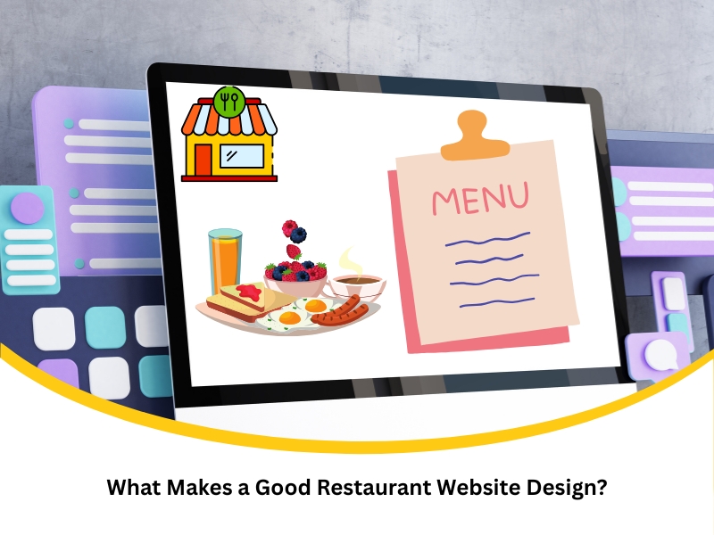
What Makes a Good Restaurant Website Design?
A strong restaurant website doesn’t just look the part — it needs to function smoothly, load quickly, and guide diners without hassle. If your site makes people wait, search, or second-guess, you’re losing business. Design choices directly affect how many customers walk through your door or place an order online. Whether you run a casual café or a high-end venue, your digital presence matters more than ever. This article explores what sets a good restaurant website design apart and how it influences every part of your customer journey.
Why do slow, cluttered restaurant websites frustrate users?
Clunky restaurant websites drive potential diners up the wall. Speed and clarity matter, and many sites fall short. When your homepage loads like a wet week and users have to dig for info, you lose trust fast. Slow, disorganised sites:
- Increase bounce rates, especially on mobile
- Confuse users with too many menu tabs or auto-playing media
- Make basic info like hours or address hard to find
- Feel outdated and reflect poorly on food quality
A slow website doesn’t just waste time — it makes users question if the food is any better. Even worse, it pushes them straight to a competitor’s booking page. That hesitation? It’s your bottom line walking out the door.
For restaurant owners seeking to enhance the user experience, exploring effective website design solutions tailored for restaurants is crucial. These solutions should prioritise speed, simplicity, and mobile performance. Clean navigation and fast load times help diners stay focused on what matters — your menu, your vibe, and booking a table.
What common mistakes do restaurant websites often make?
Many restaurant websites stumble over simple but critical flaws. Whether you’re running a local café or a fine dining venue, common missteps can scare off diners before they even view the menu. Key missteps include:
- Outdated photos that don’t reflect the current interior or food quality
- PDFs for menus, which are hard to open on mobile
- Confusing navigation with unclear CTAs
- Lack of accessibility features for screen readers
These may seem minor, but they add up. A mismatched image or dead link breaks the experience and signals disorganisation. It’s like serving soggy chips — no one comes back for seconds.
One approach to addressing this issue is to enhance restaurant appeal through visual content. Fresh, professional photos and streamlined layouts help diners envision the experience and get excited about booking. They’re not just browsing — they’re mentally already there.
Is your outdated site costing you potential diners?
You might think your current site is “good enough,” but diners today expect more. An outdated website can quietly drain your bookings, and the signs are often easy to miss. Telltale signs include:
- Low traffic but high bounce rates
- Fewer phone or online bookings despite strong food reviews
- Difficulty making updates without a web developer
- No integration with delivery platforms or Google Maps
These gaps create friction. In hospitality, friction means lost revenue. Old-fashioned layouts often appear outdated or unsafe — not a vibe you want when requesting online payments or table reservations.
To move forward, prioritise the importance of mobile-friendly restaurant websites. Responsive design ensures diners can browse and book on the go — no pinching or zooming required.

How can a good restaurant website design boost online orders?
The right design doesn’t just impress — it converts. If your restaurant offers takeaway or delivery, your website is the sales representative. It needs to be quick, reliable, and designed for action. Top features that improve orders:
- Prominent ‘Order Now’ buttons on every page
- Integrated POS and delivery systems (Uber Eats, DoorDash, etc.)
- Optimised product images for every dish
- Minimal friction in the checkout process
If your online ordering system takes too many steps, you’re burning cash. Hungry users won’t wrestle with broken pages or unclear buttons. They’ll go where it’s easier.
A good site funnels attention directly to action. When diners feel confident and find what they need without fussing around, they’re more likely to complete the order. It’s not about pushing — it’s about making the next step effortless.
What features define a good restaurant website design today?
Modern restaurant websites are built for busy diners who expect speed, clarity, and visual appeal. It’s not just about being pretty — your site should do the heavy lifting. Features that set strong designs apart:
- Clear booking options with calendar integration
- Menu pages with food categories, allergen info, and daily specials
- Integration with reviews or social proof from Google and Instagram
- High accessibility standards for all devices and users
Let’s break this down with a quick comparison:
Feature | Poor Site Example | Good Site Example |
Menu format | Downloadable PDF | Dynamic, searchable menu |
Mobile design | Desktop-only view | Fully responsive, thumb-friendly |
Booking system | Manual form or phone only | Integrated online reservations |
Imagery | Stock photos or outdated pics | High-quality, recent food photography |
Page speed | 5+ seconds load time | Loads in under 2 seconds |
Incorporating these features is about function as much as it is about form. Don’t just chase trends — focus on what helps diners act fast and feel comfortable. That’s where real results begin to show.
Is it time to upgrade your restaurant’s outdated website layout?
If your site hasn’t had a redesign in a few years, chances are it’s already behind. Trends shift, user habits change, and your food might not be getting the love it deserves — all signs your business website needs a redesign for better performance. Upgrade triggers to watch for:
- The clunky layout on mobile phones
- Branding that no longer matches your venue
- Content that’s hard to update or duplicate
- Frequent user drop-offs before completing a booking
You don’t need a fancy design overhaul every six months. But if your site feels like a relic, it’s likely undercutting the quality of your food and service.
Instead, focus on building trust through better customer relationships by ensuring your online presence matches the experience you deliver in person. A refreshed layout signals care and consistency — two things diners value highly.

How does good restaurant website design impact your business success?
A smartly designed site does more than look good — it drives real, measurable results. From increasing bookings to reducing phone calls, it supports your staff and helps you scale. Business benefits include:
- Streamlined table reservations and order flows
- Lower admin load from fewer phone or email queries
- Improved visibility on Google through SEO-friendly design
- Stronger trust and loyalty from digital-first diners
When your digital experience matches the quality of your in-person one, customers notice. It’s not about flash — it’s about functionality and confidence.
A website that works like a charm becomes an asset, not a burden. It works while you sleep, while your chefs prep, and while your staff focus on what they do best: serving great food.
Final thoughts
Investing in a good restaurant website design isn’t just about keeping up appearances — it’s a tool that backs every part of your hospitality. From attracting new diners to managing orders, the right design pays for itself.
For those unsure where to start, consider learning how Nifty Websites Australia approaches web design.