Which Website Design Trends Help Food Trucks Stand Out?

The food truck business is tricky today; everyone fights for customers online. Your website is your online food truck, where you’ve got to make people hungry and want delicious food! But how do you make your website shine with so many trucks out there?
The secret is using cool website ideas that people on their phones will love, showing off what makes your truck unique. Here are some things to think about:
How can mobile-first design make your food truck website shine?
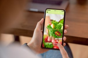
Imagine your customers are probably starving and scrolling through their phones for lunch on the bus or at work. A mobile-first website means their experience is smooth and easy on those tiny screens. Here’s what that looks like:
- Clean and simple: No fancy stuff that takes forever to load! Just clear menus, easy buttons to click, and mouthwatering pictures of your food.
- Fits any phone: The website should automatically adjust to whatever phone someone’s using. No squinting is required!
- Big buttons for hungry thumbs: Make it easy for people to order or contact you with nice big buttons that are easy to tap.
Making your website mobile-friendly becomes like your food truck itself, but online! It grabs people’s attention right when they’re looking for something yummy to eat.
Is high-quality visual content crucial for a stand-out food truck design website?
Pictures of your food truck are super important! They get people’s mouths watering and show off your yummy dishes.
- Make your food look amazing: Think of those super close-up pictures that show all the colours and textures – that’s what you want! People decide if they want to eat something with their eyes first, so make sure your food looks irresistible.

- Action shots and behind-the-scenes glimpses: Give your website visitors a taste of your food truck’s personality. Capture the energy of your team prepping food, the joy of satisfied customers, and the overall vibe of your brand.
- Short videos are great! Show how you make your food, what unique things you have on the menu, or happy customers enjoying their meals. These quick videos will keep people interested and wanting more.
Fabulous pictures and videos are like a fun story about your food truck. They make people want to visit your website and remember you later, so they’ll try your food!
Can bold branding and storytelling enhance your food truck website design?
Imagine your website is your food truck’s online best friend. It should show the same personality you have on the street!
- Stand out from the crowd: What makes your food truck unique? Are your tacos bursting with colour? Do your burgers look like works of art? Show it off on your website with pictures that make people say “wow”!
- Compelling brand story: Who are you? What inspires your food? Share your story with customers to create a connection. Are you a family-run business with a passion for fresh, local ingredients? Or a food truck with a mission to bring global flavours to the streets? Let your story resonate with your audience.
- Consistent messaging: Maintain a consistent voice and visual style across your website, social media, and your truck’s design. This creates a cohesive brand experience that builds trust and recognition.
By weaving your brand story into your food truck design website, you create a deeper connection with potential customers and attract those who resonate with your values. Make your food truck website shine on any screen with responsive design to ensure this connection is made no matter the device.
Should your website embrace user friendly navigation?
Definitely! Your website should be as easy to navigate as ordering a meal at your truck. This means:
- Easy-to-read menu: Make your menu clear and straightforward, with short descriptions and prices everyone can understand.
- No getting lost: Help people find what they need fast, like your address, hours, social media, and how to contact you. Put this stuff in a transparent navigation bar at the top.
- Find food fast: Got a giant menu? Add a search bar so people can find their favourite dish in a snap. No more scrolling for hungry eyes!

Remember, a complex website makes people cranky, and those people don’t buy yummy food! Make your website as easy as pie, and watch your food truck sales boost; happy customers return for more deliciousness.
How can accessibility features make your food truck website more inclusive?
In today’s digital world, inclusivity is vital. Implementing accessibility features on your food truck design website ensures everyone has a smooth experience.
- Colours that don’t clash: Think sunshine and lemonade, not neon signs! Use easy colours for everyone’s eyes, especially those who might have trouble seeing some colours.
- Picture power: For folks who can’t see the pictures, write a quick sentence or two explaining what’s in them. This helps unique gadgets called screen readers tell people what the image is about.
- Mobile-friendly design (as mentioned earlier): A mobile-first approach ensures your website is accessible to users with different device capabilities.
This way, everyone can find your delicious food truck, and you get to be the most excellent food truck around for being so inclusive!
The takeaway: Stand out from the curb with a stellar food truck design website
Your food truck’s website should be like a glowing sign that pulls in hungry customers! Make it mobile-friendly so everyone can find you, use mouthwatering pics to show off your delicious food, pick a fun and unique design, and keep it super easy to navigate. Don’t forget to connect your social media and make it accessible to everyone. This way, your website will be just as fantastic as your food, and everyone will return for more!
But remember, a great website is just the beginning. Regularly update your website with new menu items, location updates, and special offers. Promote your website on social media and leverage online ordering platforms to further connect with hungry customers.
Let Nifty Websites Australia design your digital storefront
Ready to take your food truck business to the next level? Nifty Websites Australia can design a mobile friendly website for your food truck. We’ll help you tell your brand story, showcase your delicious offerings, and attract a loyal following of hungry customers.
Contact the Nifty Websites team for a free consultation, and let’s get your food truck design website rolling!
