Do Creative Website Designs Improve SEO and User Engagement?
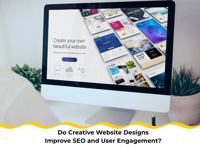
Creative website designs lift SEO and user engagement when standout visuals sit on a foundation of speed, clarity, and accessible structure. Audiences notice polish, but they stay for effortless reading, stable layouts, and fast interactions. Search engines read those signals too, rewarding pages that help people complete tasks without fuss. In competitive niches, creative website designs that guide attention—through purposeful typography, colour, and motion—earn more clicks, deeper scroll, and stronger brand recall. The catch is avoiding bloat: heavy scripts, sloppy media, and vague navigation sap trust and rankings. A better path sets a single job per page, budgets assets, and treats performance as design’s first constraint. From there, distinct imagery and micro-interactions can shine, supporting clear copy and accessible forms across devices. With that balance, creativity becomes a lever for visibility and conversions instead of a handbrake. This article maps steps to blend flair with discipline for sustained growth.
Why do many small business websites struggle to look creative yet perform well?
Many small business sites chase novelty, then lose structure. That’s a problem because visitors can’t find what matters, and search engines see weak signals. A better approach sets a single-page goal, then lets creativity guide attention to that goal. In practice, Nifty Websites Australia treats creative website designs as a performance discipline, not window dressing, so visual flair always supports speed, clarity, and accessibility. Here are the foundations to balance creativity and performance:
-
- Page purpose: Define one job for the page and design everything to support that outcome.
- Information hierarchy: Use headings, spacing, and type scale to surface the most important content quickly.
- Navigation clarity: Keep menus shallow and consistent to reduce cognitive load.
- Visual discipline: Limit colours and typefaces so unique elements pop without chaos.
- Measurable iteration: Test with users; ship minor improvements that stack results.
Keep in mind, confusing layouts bury your message. Creativity should spotlight clarity, not smother it. Mid-stream, codified rules for grids, spacing, and motion stop blowouts and keep brand personality humming.
To anchor priorities in measurable action, consider frameworks that emphasise intent-driven layouts and asset budgets, such as efficient and creative website design strategies that drive success. Use them to check that each flourish earns its keep.
How can poor web design choices impact search visibility and user trust?
Sluggish media, jumpy layouts, and unreadable text erode trust. Those issues also dent Core Web Vitals, which flow through to visibility. When the interface feels flaky, visitors bail early, and bounce signals tell a rough story. Here are the SEO and trust factors affected by design choices:
- Largest Contentful Paint: Heavy hero assets delay first impression and push users away.
- Cumulative Layout Shift: Unstable components cause mis-taps and frustration on mobile.
- Colour contrast: Low contrast fatigues readers and fails accessibility checks.
- Third-party bloat: Extra scripts slow pages and can leak privacy signals.
- Coherence: Inconsistent components make the site feel unreliable.
Addressing these drivers lifts both experience and rankings because fast pages boost trust. After stabilising the basics, streamline scripts and compress media. Then, for practical tactics on performance tuning, look to smart web design to improve website performance and map a phased rollout you can track.
What happens when websites ignore user experience and responsive design?
Ignoring UX turns simple tasks into hard yakka. Forms become fiddly, buttons hide below the fold, and text wraps poorly on smaller screens. That friction sends conversions down the gurgler and shrinks organic reach as behaviour metrics slide. Here are the mobile and accessibility essentials to restore flow:
- Mobile-first layout: Design for thumbs and small screens, then scale up.
- Fluid type and spacing: Use responsive scales that maintain readability across devices.
- Clear form patterns: Label inputs, show errors inline, and keep steps short.
- Focus states: Provide visible keyboard focus and accessible control states.
- Real-device tests: Validate on budget Android devices and older iPhones, not just simulators.
Expand inclusion, and you’ll expand the market because accessible design expands your audience. For strategy context and prioritisation, understanding why practical website design matters for small businesses is essential. Structure upgrades so each change measurably improves completion rates and readability.
How do creative website designs build a stronger business brand online?

Creativity leaves a lasting impression when it’s consistent. Colour, typography, and motion align to carry a single story that users can recognise at a glance. That cohesion de-risks decisions and shortens the path to enquiry or purchase. Here are the brand-building levers within design systems:
- Design tokens: Centralise colour, type, spacing, and motion to keep elements consistent.
- Narrative cues: Use imagery and copy that underline a clear value proposition.
- Microcopy: Reduce anxiety with plain-English helper text at decision points.
- Purposeful motion: Animate to signal state changes, not for showboating.
- Pattern libraries: Reuse components to speed delivery and train expectations.
Well-chosen visuals don’t just look schmick; distinctive visuals reinforce memory. Over time, that familiarity turns into trust, and trust into action. Keep reinforcing the same cues across pages and channels to compound recognition.
How do creative website designs influence user behaviour and engagement?
Design shapes behaviour through contrast, spacing, and content order. When the eye knows where to go next, visitors keep exploring. They scroll deeper, engage with key modules, and complete tasks more often. Here are the behavioural design tactics that lift engagement:
- Journey mapping: Sketch the decision path before layouts so content supports intent.
- Contrast and weight: Use colour and hierarchy to spotlight the primary action on each screen.
- Micro-interactions: Add hover, press, and progress feedback to reduce uncertainty.
- Friction placement: Remove hurdles from exploration; add checks only where risk lives.
- Measurement: Track scroll depth, click concentration, and time on task, not vanity metrics.
Avoid the trap where clunky navigation drives bounces. Clear labels and stable menus keep people moving like a well-oiled tram timetable. Keep iterating by watching heatmaps and session replays; small fixes often deliver big wins.
How can creative website designs align with performance and hosting goals?
Performance is the backbone of presentation. Without it, creative decisions fall flat, and conversions cop a hit. Hosting choices, caching strategy, and asset budgets determine how the site feels in the real world. Here are the performance and hosting priorities to lock in:
- Asset budgets: Cap images and JS per page; refuse regressions at PR time.
- Edge delivery: Use a CDN close to Australian audiences to lower TTFB.
- Caching strategy: Combine server caching with smart client hints and preloading.
- Observability: Monitor Core Web Vitals in field data, not only lab scores.
- Capacity planning: Prepare for seasonal spikes with autoscaling and log insights.
Informative table — target benchmarks and verification tools:
| Decision area | Good baseline | Stretch goal | Tooling to verify |
| LCP (mobile) | ≤ 2.5 s | ≤ 1.8 s | PageSpeed Insights, field RUM |
| CLS | ≤ 0.10 | ≤ 0.03 | Lighthouse trace, RUM |
| JS payload | ≤ 200 KB | ≤ 120 KB | Bundle analyser, build stats |
| Image weight/page | ≤ 800 KB | ≤ 400 KB | WebPageTest, CDN reports |
| TTFB (AU users) | ≤ 0.7 s | ≤ 0.3 s | Real-user monitoring + logs |
Hosting and architecture matter because slow hosts sabotage conversions. To frame decisions within recognised principles, fold in official Australian guidelines for professional website development. Use those best-practice notes to keep experience, security, and accessibility tight across updates.
Final thoughts on creative website designs and digital growth
Creative design boosts visibility and engagement when it works with speed, stability, and plain-English messaging. Start with a single goal per page, prioritise content order, and set performance budgets before pixels. Then add distinctive brand cues, test on everyday devices, and keep measuring. If it’s time to sketch practical next steps with a local team that speaks human, explore how Nifty Websites Australia builds websites that convert visitors to map a no-pressure plan.