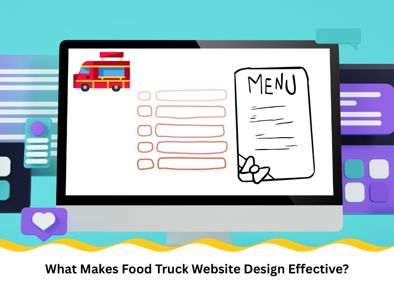
What Makes Food Truck Website Design Effective?
Food trucks thrive on quick service and street appeal—your website should be no different. A well-crafted food truck website design ensures your site loads fast, guides users clearly, and reflects your brand’s personality with zero confusion. Every interaction matters when customers are deciding whether to find you or place an order. A great food truck site doesn’t just look good—it works hard behind the scenes to boost visibility and streamline orders. This article explores the key design choices that influence how effectively your site performs.
Why do some food truck websites struggle to attract new customers?
A food truck website is often the first impression for potential customers, yet too many fall short. If your website loads slowly, is hard to navigate, or isn’t mobile-friendly, potential customers are likely to leave before placing an order. You’re not just competing with other trucks—you’re also up against cafes, delivery apps, and whatever else your customer sees in their search results. Here’s where these websites often lose traction:
- No integration with local SEO strategies, so people can’t find you
- Outdated design that doesn’t reflect your food or brand
- Cluttered menus or information overload that confuse users
- No real focus on mobile usability, even though it’s where most traffic comes from
Solving these issues starts with making the user journey smoother. Mobile-first design, geolocation features, and clear menus can make all the difference. For food truck owners seeking to enhance site performance, exploring web design solutions tailored to food truck businesses can help address specific friction points and convert more visitors into customers.
What common mistakes ruin food truck website design?
Even with good intentions, a few common errors can drag your site down. Too much text, missing links, or confusing layouts all make users bounce before they’ve even seen your menu.
Mistake | Why it hurts | What to do instead |
Long blocks of text | Hard to skim on mobile | Use headings, bullet points and short blurbs |
Hidden contact details | Frustrates users trying to get in touch | Keep phone, socials and address visible |
Outdated food photos | Feels untrustworthy | Upload fresh images that show your vibe |
No clear call-to-action | Users don’t know what to do next | Add one button per page with a clear goal |
It’s a real shame when good food gets ignored because the site doesn’t back it up. Tweaking a few design elements could quickly turn things around.
Many successful operators recognise how small layout changes and smart structuring lead to tangible improvements. These are just some of the ways a food truck site can boost your truck’s sales by supporting faster decisions and cleaner user flows.
How does slow site speed impact food truck sales?
Speed affects everything—from how long users stay on your site to whether they complete an order. In the food truck game, where decisions are often made on impulse, a few seconds can cost you a customer. Here’s how slow sites sabotage conversions:
- Longer load times make users think your business is less professional
- High bounce rates because customers don’t wait for full page loads
- Poor mobile performance, especially during peak hours
- Abandoned carts due to laggy checkout or delays in confirming orders
Every second matters. A user waiting more than three seconds is likely to leave, and search engines will rank you lower, too. Optimising speed through compressed images, minimal scripts, and reliable hosting pays off.
Improving speed also enhances your ability to connect with users during high-demand moments. That’s why many food truck websites focus on strategies to improve how businesses communicate with customers, blending speed with meaningful user interaction.
What features make a food truck website truly engaging?
Visuals grab attention, but engagement keeps it. Your website should feel like your truck—vibrant, helpful, and full of personality. When the design helps visitors explore, order, and plan without hitting snags, they’re far more likely to return. Strong engagement features include:
- High-resolution menu images optimised for mobile
- Map integration that shows your current or upcoming locations
- Tap-to-order buttons that work instantly on all devices
- Updates or alerts for new menu items or limited-time offers
These aren’t bells and whistles—they’re tools for real customer action. When users interact with your site, it should feel natural and intuitive, never forced or overdone.
To enhance the user experience of your website, it is beneficial to focus on features that make food truck websites interactive, ensuring users can engage with both the content and the ordering system in seamless ways.

How can strategic food truck website design boost orders?
Design isn’t about being flashy—it’s about solving problems. For food trucks, the primary goal is to get people from your homepage to checkout quickly and without confusion. This isn’t about guesswork—it’s about guiding actions. Here are tactics that can directly influence customer orders:
- Clear, tap-friendly order buttons on every major page
- Highlighted daily specials or meal deals
- Clean layout that breaks down items by category
- Cart icons or sticky order buttons that follow users through the page
These features make ordering less of a task and more of a decision. If the design removes friction, more people will follow through.
Smart design moves don’t require huge investments. They can be simple tweaks that align visuals with action and reinforce trust. The key is making things easier, not fancier.
What should food truck websites prioritise for user experience?
A great user experience (UX) is invisible—it just works. Good UX isn’t flashy or complicated. It simply allows visitors to access what they want quickly and without confusion. That’s what turns curiosity into conversions. Food trucks should focus on these UX priorities:
- Navigation that’s always available and never clunky
- Clean, legible fonts that are easy to read at a glance
- Predictable page structures with fewer layers or distractions
- Quick contact access like phone tap-to-call or live location map
Each one plays a role in reducing bounce rates and encouraging repeat visits. If a customer had an easy time ordering once, they’re far more likely to do it again.
Is investing in food truck website design the right choice?
Running a food truck comes with tight margins, and every dollar spent needs to justify itself. But digital tools aren’t just a luxury—they’re often the very thing that keeps you competitive. Your website can quietly do a lot of heavy lifting in the background. Here’s what strong design helps you achieve:
- Higher visibility in local search results and map listings
- Faster ordering that reduces queue times and walkaways
- Increased trust from new visitors through visual consistency
- Better retention by linking features like order history or subscriptions
A well-made site works around the clock, effortlessly guiding both new and returning customers. It anticipates their questions, encourages action without pressure, and shows why white label web design is key for sustainable digital growth.
Final thoughts
Your food truck might win over crowds with bold flavours and quick service, but a strong website builds those crowds in the first place. It connects with customers, answers their questions, and lets them act immediately. If your digital space feels effortless, people will continue to come back.
If you’re unsure where to begin or what matters most for your niche, explore how Nifty Websites Australia enhances online presence with tools tailored for mobile-driven food truck businesses.