Which Website Design Ideas Improve Navigation?
Finding your way around a website shouldn’t feel like navigating rush hour in Sydney. Yet, for many users, that’s exactly how it feels. The best websites’ ideas balance creativity with logic, leading visitors effortlessly to where they want to go. Strong navigation is more than just menus and buttons — it’s how your design whispers, “this way, mate,” without saying a word.
When navigation works, users stay longer, explore deeper, and convert faster. But when it doesn’t, they bounce faster than a roo on a hot tin roof. So, which website design ideas truly improve navigation and user flow? Let’s take a deep dive.
Why do so many websites struggle with intuitive navigation?
Websites struggle with intuitive navigation when structure and logic take a backseat to design flair. The most common website layout problems come from cramming too much into one page, vague labels, and inconsistent menu placement. Users don’t want to guess — they want direction. Even well-meaning designers often assume what feels clear to them will make sense to everyone. That’s a trap. Users bring different devices, goals, and expectations, so a rigid layout can backfire. Here are a few red flags you might recognise:
- Menus that shift or disappear between pages
- Multiple calls to action competing for attention
- Pages that load slowly or require endless scrolling
- Inconsistent icons or terms for the same function
When navigation feels clunky, people give up fast. Poor site structure drives visitors away and can even hurt search rankings. One proven fix is to start with user testing early. Map the most common paths through your site — from the homepage to key services or products — and simplify them. Then apply insights from professional website design services to ensure consistency and usability from top to bottom.
How poor visual hierarchy can confuse site visitors?
Visual hierarchy determines how users process information on a page. If everything shouts for attention, nothing gets noticed. Many sites ignore visual hierarchy design principles, layering multiple focal points, mismatched fonts, and bold colours that fight each other. When hierarchy fails, your users’ eyes bounce all over the place, unsure where to focus. It’s like being at a barbecue where everyone’s talking at once — you miss the important stuff. Strong visual hierarchy, on the other hand, guides visitors naturally through your content. To keep it simple:
- Use heading sizes that reflect importance
- Maintain consistent alignment and spacing
- Reserve bright colours for actions you want clicked
- Pair images and text in a logical reading order
When structure reinforces meaning, users relax — and that’s when conversions happen. You can dig deeper into this concept by exploring principles of visual hierarchy in design.
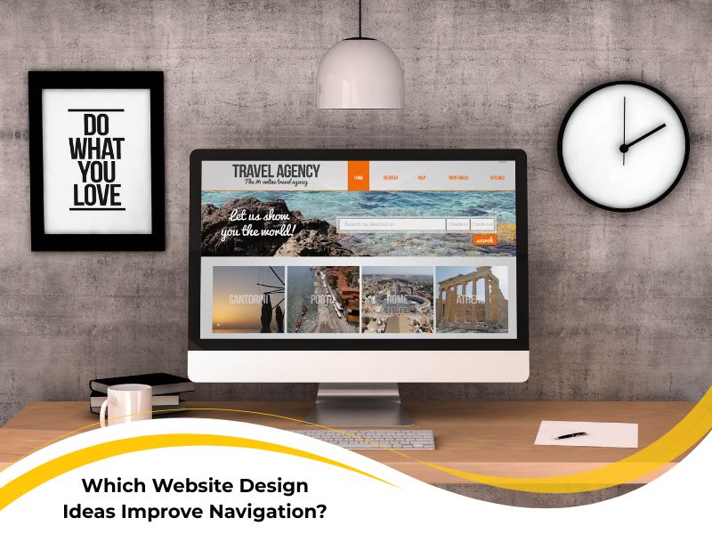
What website design ideas actually enhance user flow?
The most effective creative website design ideas focus on flow — that sense of effortless movement from one section to another. A design that flows doesn’t make users think twice. Every element feels like it belongs exactly where it is. Too often, though, design becomes a guessing game of trends. Parallax scrolling, oversized hero videos, or flashy animations might look cool, but they can block the user’s path. Remember: if visitors can’t find what they came for, the design fails.

Here’s what helps:
- Consistent navigation labels — users trust familiarity
- Predictable placement of menus and buttons
- Visual anchors like breadcrumbs and progress indicators
- Logical grouping of related content
The beauty of good design lies in its clarity and restraint. By following simple flow-based design rules, you’re giving users a stress-free path — one they’ll remember next time they visit. For a broader creative perspective, explore the best design ideas for navigation.
How can designers use colour and spacing to guide attention?
Colour and spacing are quiet heroes of navigation. When used right, they tell users where to look, click, and stay. Website colour psychology and colour spacing techniques give meaning to every gap, hue, and highlight. Spacing separates sections so the eye can rest. Colour signals hierarchy — brighter for actions, softer for context. When the two work together, your design feels breathable and natural. Try these strategies to sharpen attention:
- Choose one accent colour and use it consistently
- Leave breathing room between clickable elements
- Match contrast ratios for readability
- Balance visual weight — heavy left, light right, feels stable
For example, highlighting a call-to-action with a bold button colour while surrounding it with ample white space creates balance and emphasis. It’s subtle, but it works wonders — and if you’re chasing reliable government-approved guidance on mobile-friendly layouts, this approach keeps your site both elegant and accessible.
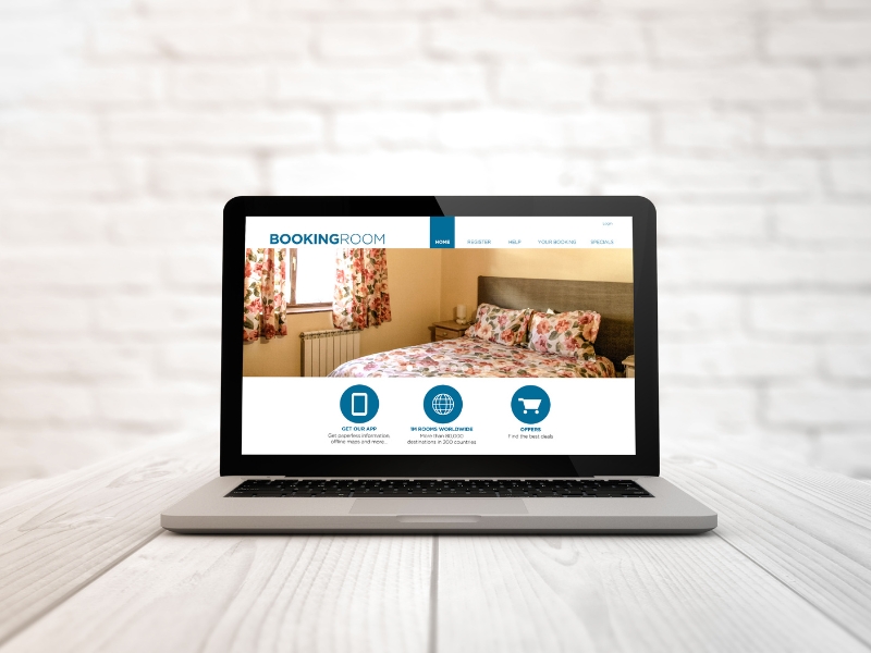
Why responsive menus are key to modern navigation
Ever tried tapping a tiny menu link on your phone, only to hit the wrong one? Frustrating doesn’t even begin to cover it. That’s why responsive menu design is essential for modern navigation. A responsive menu adapts seamlessly across devices, making sure desktop and mobile users get the same intuitive journey. With today’s browsing habits, ignoring mobile users is like ignoring half your crowd. Here’s what makes responsive menus shine:
- Expandable icons that reveal clear submenus
- Sticky navigation bars that stay accessible while scrolling
- Simplified structure with fewer top-level items
- Fast, thumb-friendly buttons and spacing
Users shouldn’t have to pinch, zoom, or squint — ever. With smart coding and flexible layout grids, responsive design keeps everyone happy and engaged. The flexibility improves user trust and keeps them returning.
Final thoughts on visual website ideas that improve navigation
At the end of the day, improving simple web navigation is about thinking like your user. Every click, scroll, and pause should feel intuitive. When in doubt, simplify — remove what doesn’t add value and amplify what guides attention. Remember these takeaways:
- Build layouts that prioritise user paths over visual gimmicks
- Reinforce hierarchy through consistent colour, spacing, and typography
- Make sure your site feels natural on every device
Smooth navigation isn’t luck — it’s good planning. For more tailored direction, you can always turn to insightful guidance from Nifty Websites Australia.